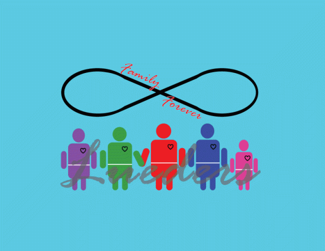
I took a lot of time thinking about this collage. I knew this one would be hard for me because it is such a personal and conceptual assignment. This assignment had to be done completely out of thin air and it had to relate to our topic. My topic is so important to me that I knew it would be difficult to really match how valuable my family is to me but I was able to do it with a few of the personal ideas I threw into it.
I started this design by building the infinity sign on the top. The infinity sign is a great physical descriptor of family because of a families value to each other. The infinity logo represents exactly what the words say. It shows that family is forever and shares the value of a families love and support of one another. I designed that first and then added the words on top. I loved the design but it was not enough for me.
The importance of my family can’t be symbolized by just one simple design because that is not who we are. We are all different and we are all unique. I need to show that in the design to help the audience better understand the logo. I added the figure and took the android design and put my own spin on it. At that point it only needed to be customized a little bit more.
At this point I looked at the design and I thought to myself what can I do to show that personalities of my family. I then thought to color each person the color of their favorite color and it showed that even though we are one big family, we all still have our own traits. I then added our last name on top to really connect us and add the personal touch that connects all of us.
To finish it off I just need to change the background so it wasn’t so plain so I added and layer and made it light blue. I really loved what it did for the overall image and I like how it turned out. It ended up being a very fun project after stressing about it for so long.

The first thing about this logo that really caught my eye was the use of color. I like that you use a lot of colors because it seemed to keep me interested and it made me want to look at all aspects of the logo. The first suggestion I would say to somehow tie the infinity symbol and the people below it together more. I feel like if you did that the logo as a whole would be more cohesive. I really like how you put your last name in cursive over the people. The use of different fonts throughout the logo also makes it interesting. One thing to think about is if it could be easily scaled smaller and made bigger. I think there’s a lot going on with this logo (which isn’t a bad thing) but I think if you had to make it smaller it might be hard to see. Overall, I really like this logo and I think you did an awesome job!
Wow, I really like your logo! It’s colorful, meaningful, and creative. You did a great job incorporating what you learned from the tutorials into your logo. I like the little people with the individual hearts and the infinity sign at the top. I like how you used the ellipse tool to help create the people and I’m assuming you used the brush tool to make the infinity sign? One of my suggestions for improvement would be to move the word that is across the people. It’s hard to see and read, and I feel it could be better understood if it was darker or moved a little below the image of the family. Don’t get me wrong though, I love the idea of placing the word faintly over the rest of the logo. Another suggest I would make is to add a border. There is so much space of empty blue space that I feel you could take advantage of it and add a creative frame, or maybe cut the logo to be a circle, so that you eliminate the empty space. Overall, you did a really good job of expressing yourself through the logo and using the tools to construct a one of a kind logo.
After looking over my project and reading the suggestions, I love some of the ideas they have shared. First things first, I need a border. There’s a lot of empty space and at this point I think that is a bad thing. I will also make the logo bigger to fill in the space more. The design as a whole is very meaningful and I don’t want the space to take away from it. I like the idea of making it one design so I’m going to mess around with it and try to make it more cohesive. The infinity sign and my family are both very important parts of the design and I don’t want to lose the effect they have on the overall meaning but the way it looks right now doesn’t necessarily look like a logo, as it looks more just like a design. Since this is our logo project that is what I want as a finally project. I am excited to see how it looks after I incorporate all of this in to it.
~Jake